Table of Contents
Introduction
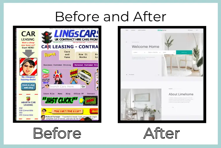
Website design is like a digital handshake; it’s the first impression that people have of your business. If it’s simple, attractive, and easy to use, people will have a better time exploring and enjoying all of your offerings. Website design isn’t just about making it look good; you also need to think about how to make it easy for people to use and hold their attention.
Websites with stunning designs can still fail to achieve their objectives if fundamental elements fail to amaze users. Whether you’re running an online e-commerce shop or showcasing a portfolio, any issue in your web design could quietly be working against you.
In this piece, we’re going to look at six common web design mistakes that could negatively impact your website’s efficiency and success. These are the issues to avoid while collaborating with a web design company or operating your own website with an in-house team.

1. Ignoring Mobile-Friendly Web Design
Why Mobile-First Web Design Matters
Currently, mobile users consume a significant proportion of the internet. Mobile users are less likely to visit your site if it is difficult to use on smaller screens. The majority of website traffic now originates from mobile devices; consequently, a website that doesn’t adapt to different screen sizes risks losing customers, affecting user experience, revenue, and search engine rankings in a negative way.
Common Mobile Web Design Mistakes
One common error is having unresponsive layouts that require constant zooming in and out. Slow load times are another problem that likely irritates mobile users even more than desktop ones. Poor touch navigation, such as tiny buttons and oversized or small text, also turns away potential clients. Whether you are maintaining your website’s in-house team of web designers or hiring a web design service provider, it is important to put mobile compatibility first in order to maintain user engagement. Make sure your website is mobile-first.
2. Poor Navigation in Your Web Design
Why Clear Navigation Is Critical
Have you ever been on a website and couldn’t understand where to go next? Users are more likely to leave your site in search of one that meets their needs if they are unable to find what they are looking for in a timely manner. When users feel lost, it undermines your brand’s image and trustworthiness. Clear, straightforward navigation is a key component of excellent web design but is sometimes overlooked, resulting in high bounce rates.
Web Design Tips for Better Navigation
A cluttered or confusing menu can overwhelm users. Instead, simplify your navigation by using a clean, intuitive menu that’s easy to find. Keep the number of menu items limited, categorize information logically, and include a search bar. Ensure there’s a clear path for users to follow from one section to another. This is especially important for businesses, where potential clients judge your expertise based on how user-friendly your own website is. These simple web design tips will help users quickly find what they need, and they even include a search bar and breadcrumbs to make the journey smoother, which can reduce frustration among users.
3. Overloading Your Web Design with Too Much Content
How Content Overload Affects User Experience
Although content is important, too much of it might be overwhelming to visitors and is not always preferable. Even if the information is valuable, people are less inclined to interact with walls of text. Too many text blocks, pictures, or pop-ups make an unpleasant user experience and often result in high bounce rates. Balancing visuals with content is essential for an engaging user experience.
Web Design Solutions to Streamline Content
To avoid this mistake, prioritize key information on your pages, use white space to give the eyes a break, and highlight only the most important information. Break up text with headers, bullet points, and visual elements (images, pictures, or photos). Here is a suggestion: hire a web design company; they are the ones who can ensure that your website will be able to spread messages clearly without making it overwhelming your audience.
4. Slow Website Speed Due to Poor Web Design
How Slow Load Times Hurt Your SEO and Conversions
Did you know that a delay of just one second in page load time can reduce conversions by up to 7%? Slow websites not only frustrate users but also harm your SEO (Search Engine Optimization). Websites that load quickly are given priority by search engines like Google; a slow-loading page will rank lower, which can have a big impact on visitors. You risk losing potential customers before they get a chance to view your products/services or offers if your pages take too long to load.
Web Design Techniques to Improve Speed
There are various ways to optimize your website speed. Start by compressing images, minimizing the use of heavy plugins, and enabling browser caching. These web design techniques improve load times, which can boost both SEO and user engagement. Hiring a web design services company can help streamline your site to perform optimally. It’s essential to stay on top of these technical elements, as faster websites directly translate into better customer retention and improved search rankings.
5. Neglecting Accessibility in Web Design
Why Web Design Accessibility Is Crucial
Accessibility is not only about getting a larger number audience but also a legal need in many different parts of the world. A website that cannot be accessible to those with disabilities loses a huge chunk of users. Accessibility in web design means that all users, irrespective of physical limitations, can browse and engage with your website. Neglecting accessibility not only restricts your reach but can possibly lead to legal troubles.
Simple Web Design Tweaks for Better Accessibility
There are a few things that you can adopt to make your website more accessible, like adding alt text to images, which also helps in SEO, using headings that are descriptive, making sure the site can be navigated without getting lost, and incorporating screen reader compatibility. If you are sure that you might not be able to do these things on your own, hire a web design company that can assist you in making these changes and converting your website into a user-friendly website.

6. Lack of Consistency in Web Design Elements
The Impact of Inconsistent Web Design on Brand Perception
If a website’s pages use different fonts, colors, and designs, it might come out as unprofessional and chaotic. When there is inconsistent website design, users find it harder to trust your business since it creates doubt and harms your brand’s reputation.
Web Design Tips to Maintain Consistency
Make a style guide outlining your brand’s colors, fonts, and image styles. Ensure that these items are used consistently on all pages. A uniform design promotes trust and makes your brand appear sophisticated.
Conclusion
In order to achieve success online, you absolutely need to have a website that is functional and also easy to use. To construct a website that is of high quality, you need to place a high priority on usability, functionality, and providing consumers with a pleasant experience. An outstanding website consists of plenty more than just a design that is captivating to the eye. You can speed up your website, improve user engagement, and maximize conversions by avoiding these six typical web design issues: poor navigation, slow loading times, a lack of mobile optimization, and unnecessarily stuffed content. If you are in doubt about the current state of your website, it is time to consult a web design company or even consider using professional web design services. This will provide your website with the necessary competitive edge that it needs to be successful.
You might attempt to resolve these issues on your own, but it is usually more beneficial to take the initiative to seek assistance from a professional. If you decide to work with a professional web design agency in California or employ web design services in California, you can rest assured that your website will look incredible and function without any problems. This is true regardless of which option you choose.
By addressing these six web design mistakes, you will be able to create a website that not only looks nice but also functions effectively, and this will ensure that your company is successful online.
Also Read:

